Concept & Strategy – Kaiser Permanente
Nurses week
As a recurring brief to celebrate some of our most essential employees during this annual week of national recognition, it’s one of the most meaningful projects I work on. The creative challenge changes every year because the context does too, but the goal is always the same: find a way to make that recognition resonate.
ROLE
Visual concept development, animation, some production design
AUDIENCE
Kaiser Permanente nurses and colleagues
DELIVERABLES
Visual concept for yearly theme, production-ready assets
2021 — an impossible brief
In 2021, nurses weren't just working — they were carrying the weight of a pandemic that had redefined what it meant to show up every day. The recognition campaign needed to match that gravity.
The concept was simple and radical at the same time: make every nurse feel individually seen, while capturing the power of what they were doing collectively.
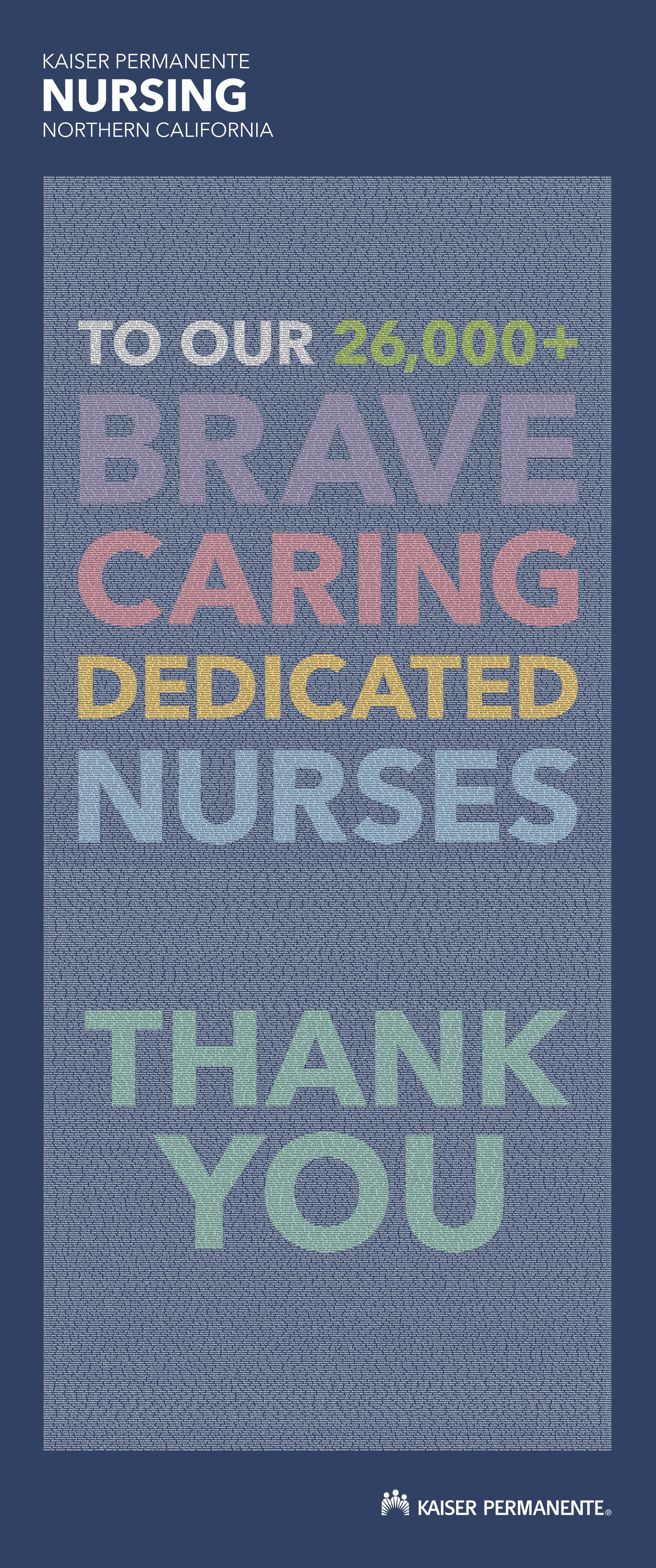
facility banners
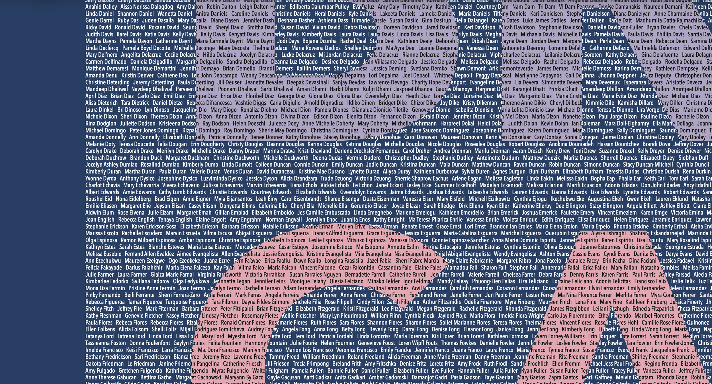
26,000+ names
That idea took two forms. A print banner listed every single nurse's name — not a stock photo, not a tagline, just names filling the frame. A reminder that behind every shift was a real person. I did the final production design in addition to the concept.

Animated video
The same idea moved into motion through a video where each nurse became a dot — abstract and individual, but part of something larger. As the dots gathered and moved together, the video recognized the collective contribution during an impossible time. To do the animation for this video, I used expressions to create organic-feeling motion, automatically generate color variety, and save me from having to animate each dot individually.
2026 — an empowered moment
This year's theme arrived at a different moment. Nurses weren't just surviving — many KP hospitals were on the path to Magnet recognition, a distinction that reflects what the nursing profession has always known about itself. The campaign needed to rise to meet that energy.
I developed and presented three directions alongside concepts from two other designers.
We were also tasked with creating a broader visual system that could extend to other nursing-recognition events, including Certified Nurses Day.
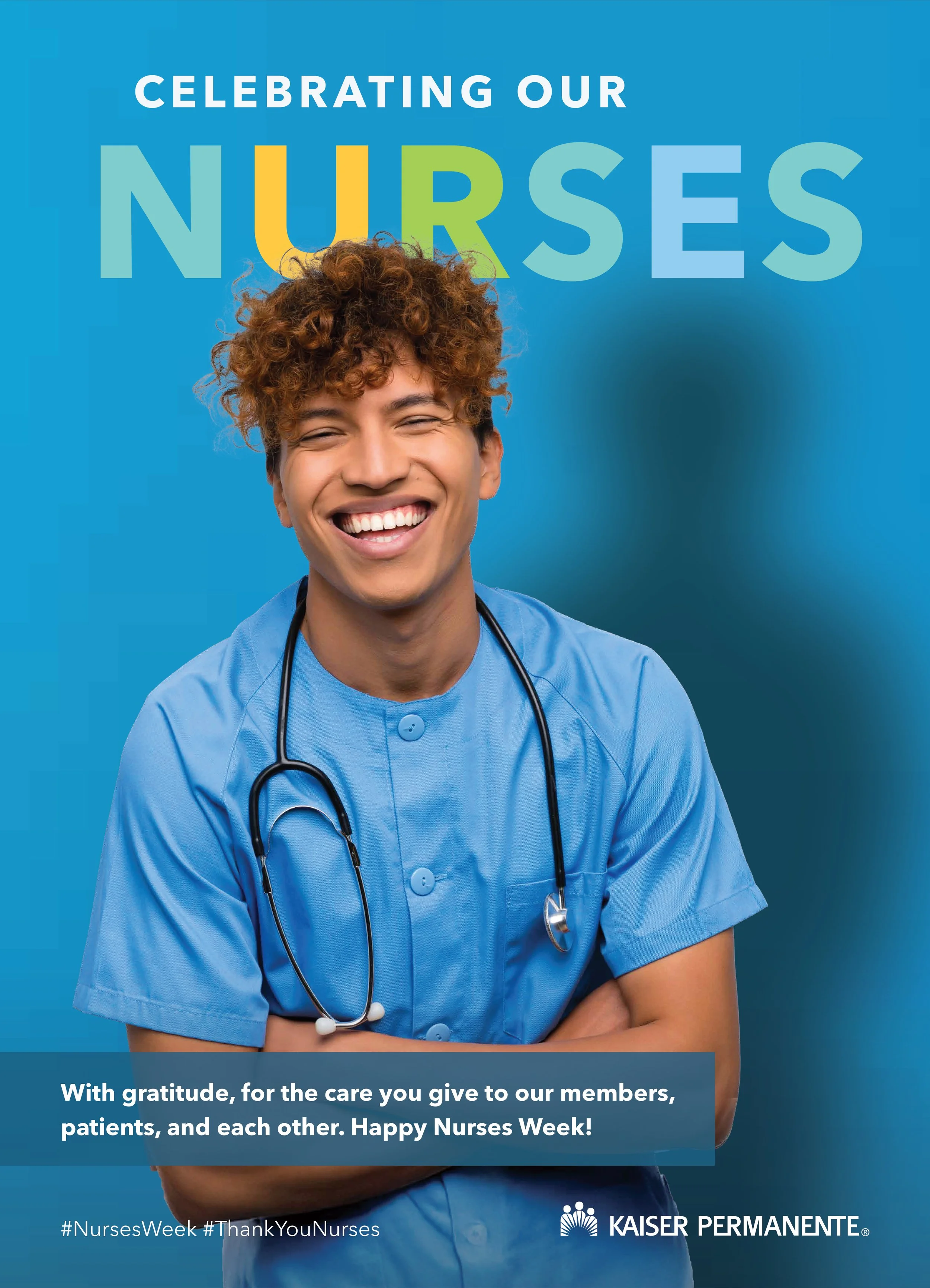
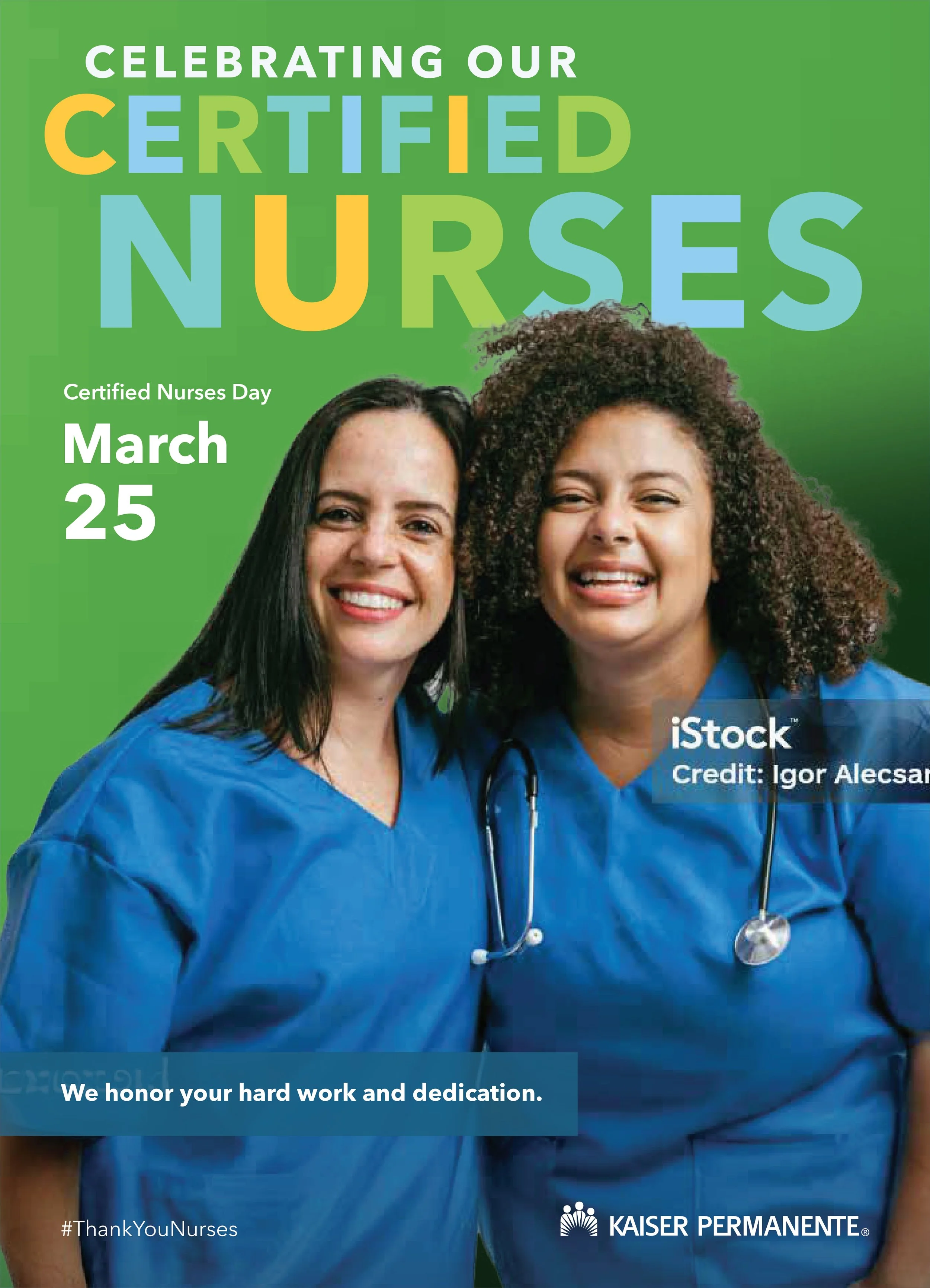
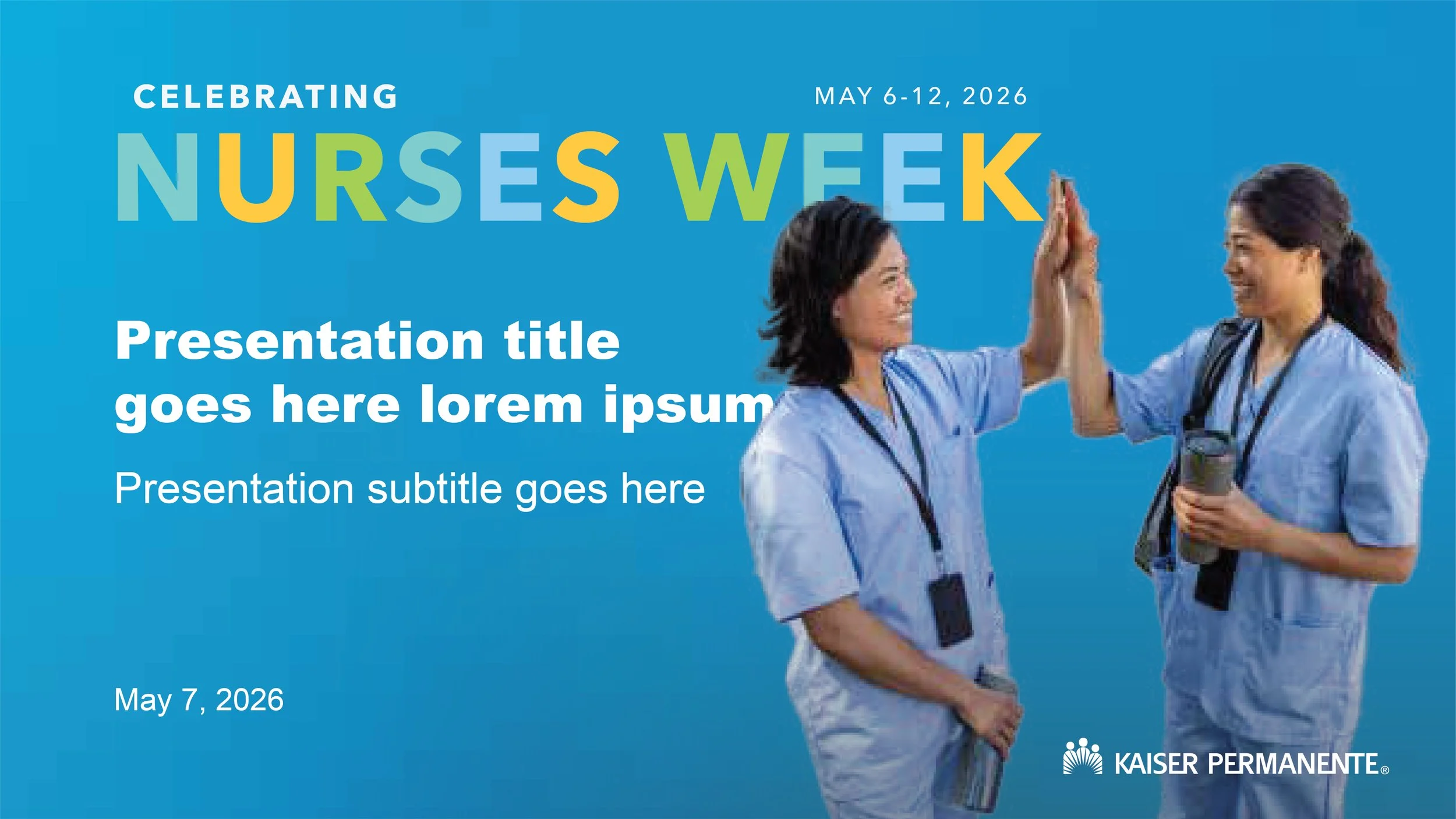
Joyful and celebratory
The first repurposed a bold, empowering, and celebratory direction from another project — the Aging Well Summit — one we loved but that ultimately wasn't chosen. This year's Nurses Week theme felt like it could be the right home for it. Candid portraits shot against a studio backdrop and paired with graphic type brought the subjects forward and humanized them beyond just their role as nurses within the organization.
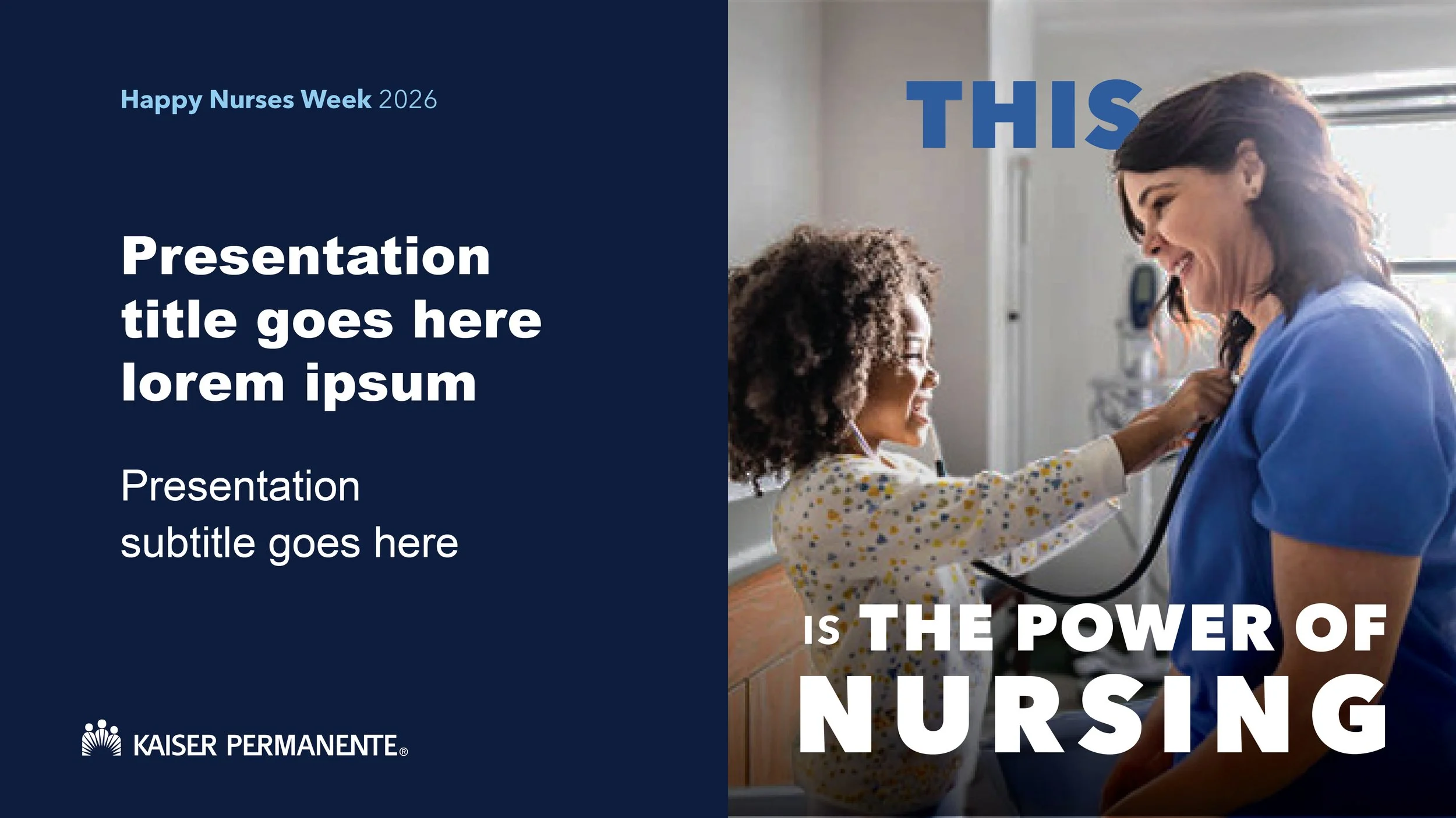
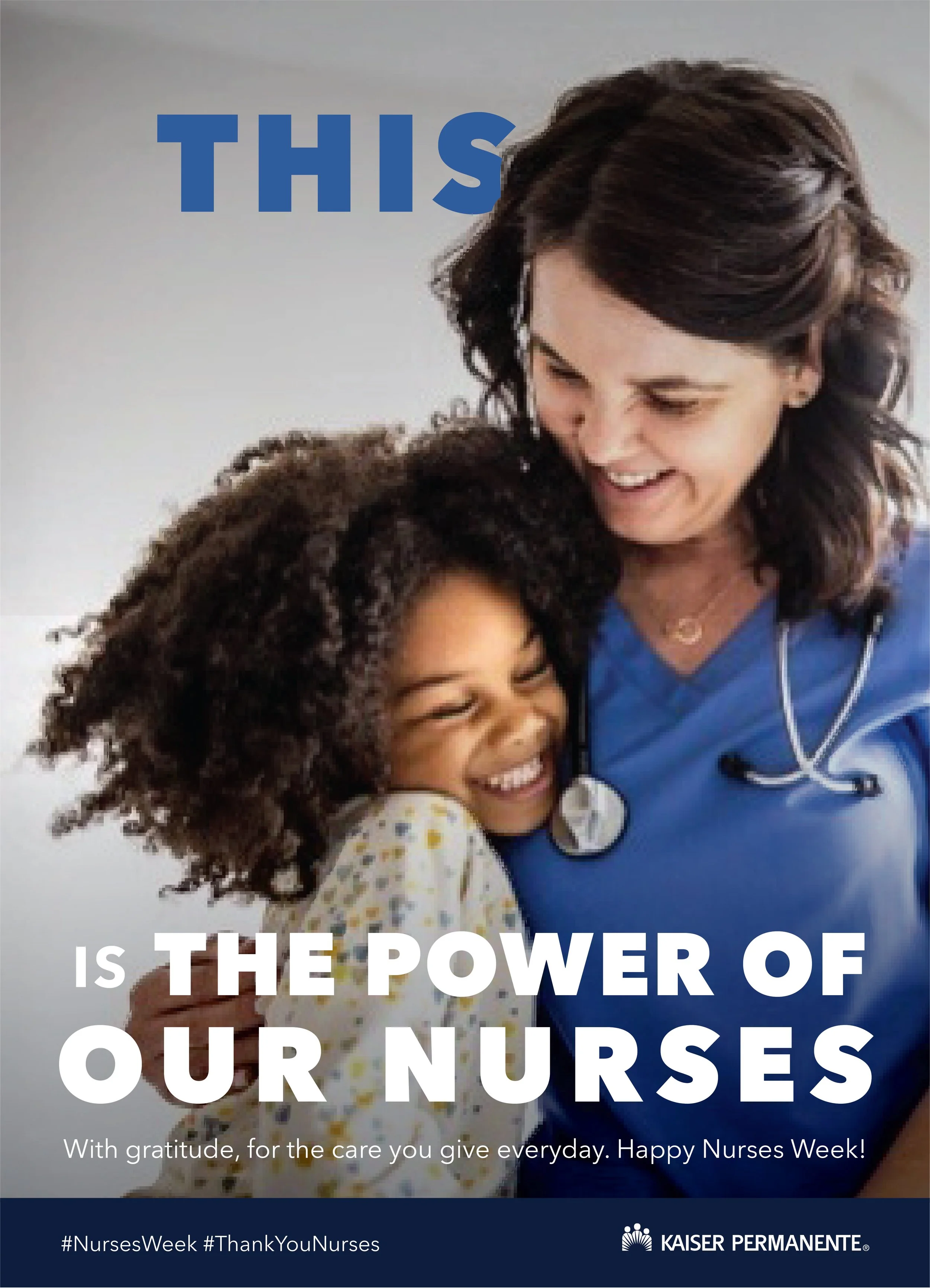
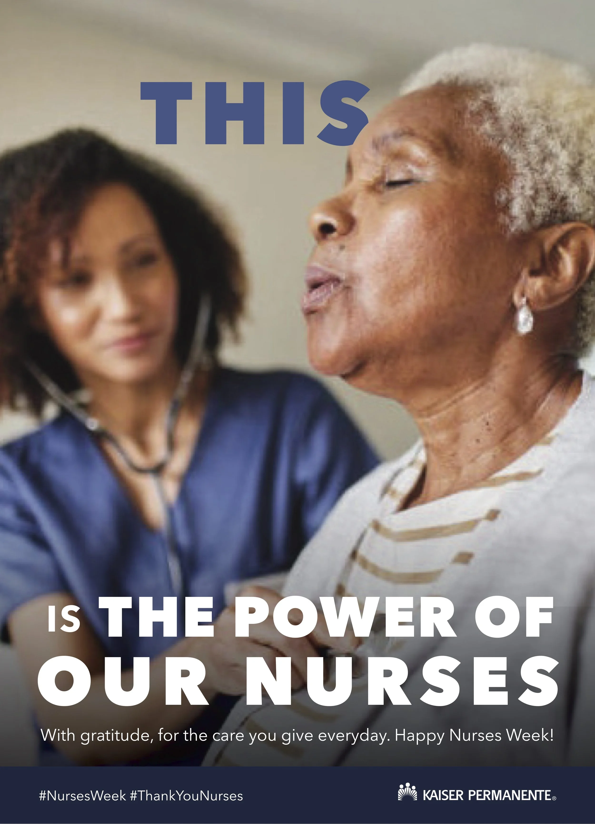
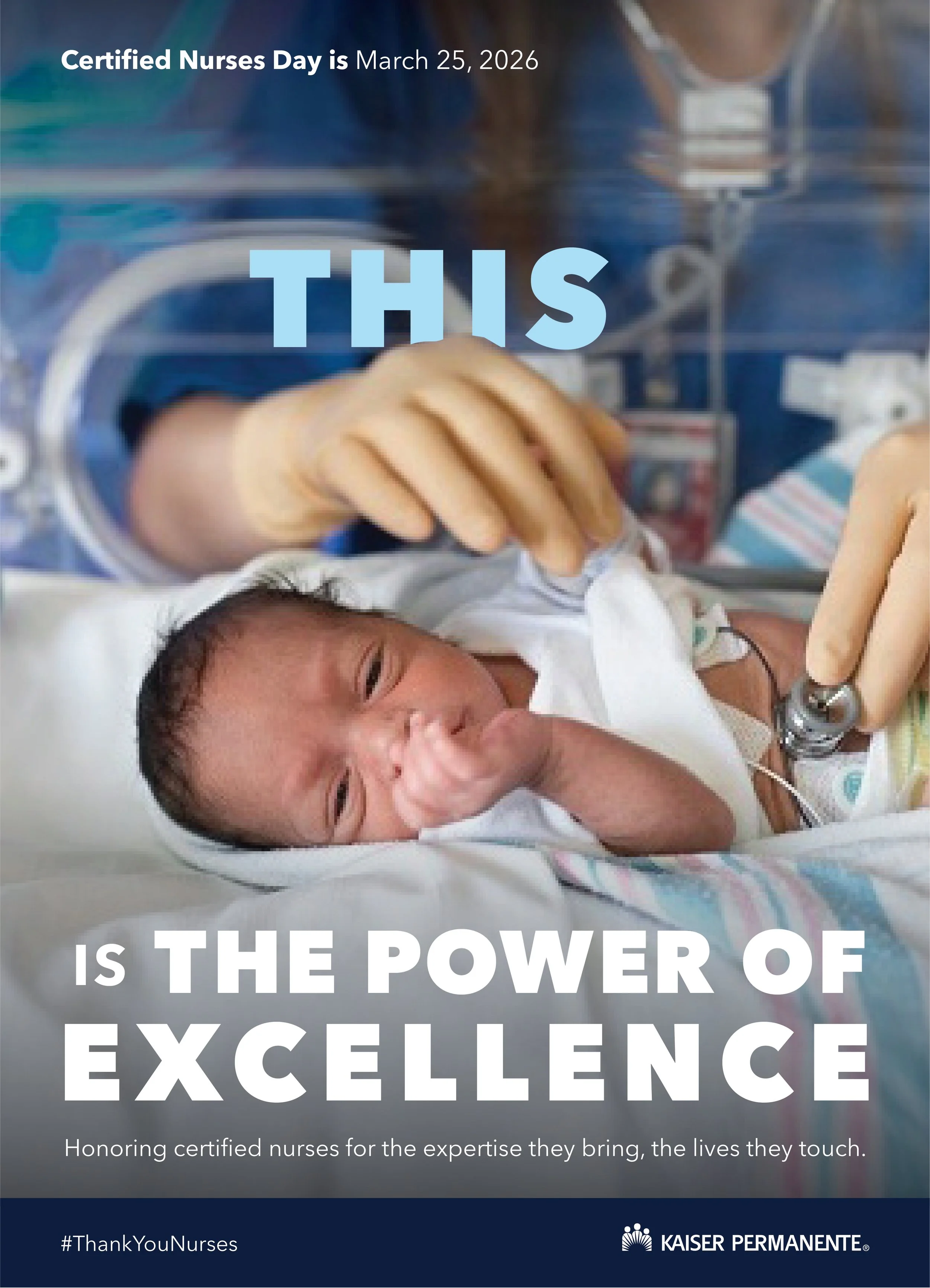
centering nurses in action
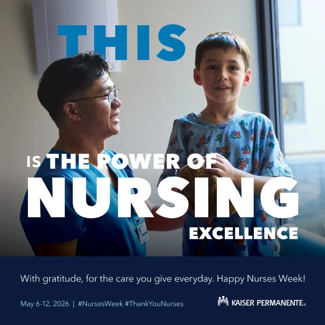
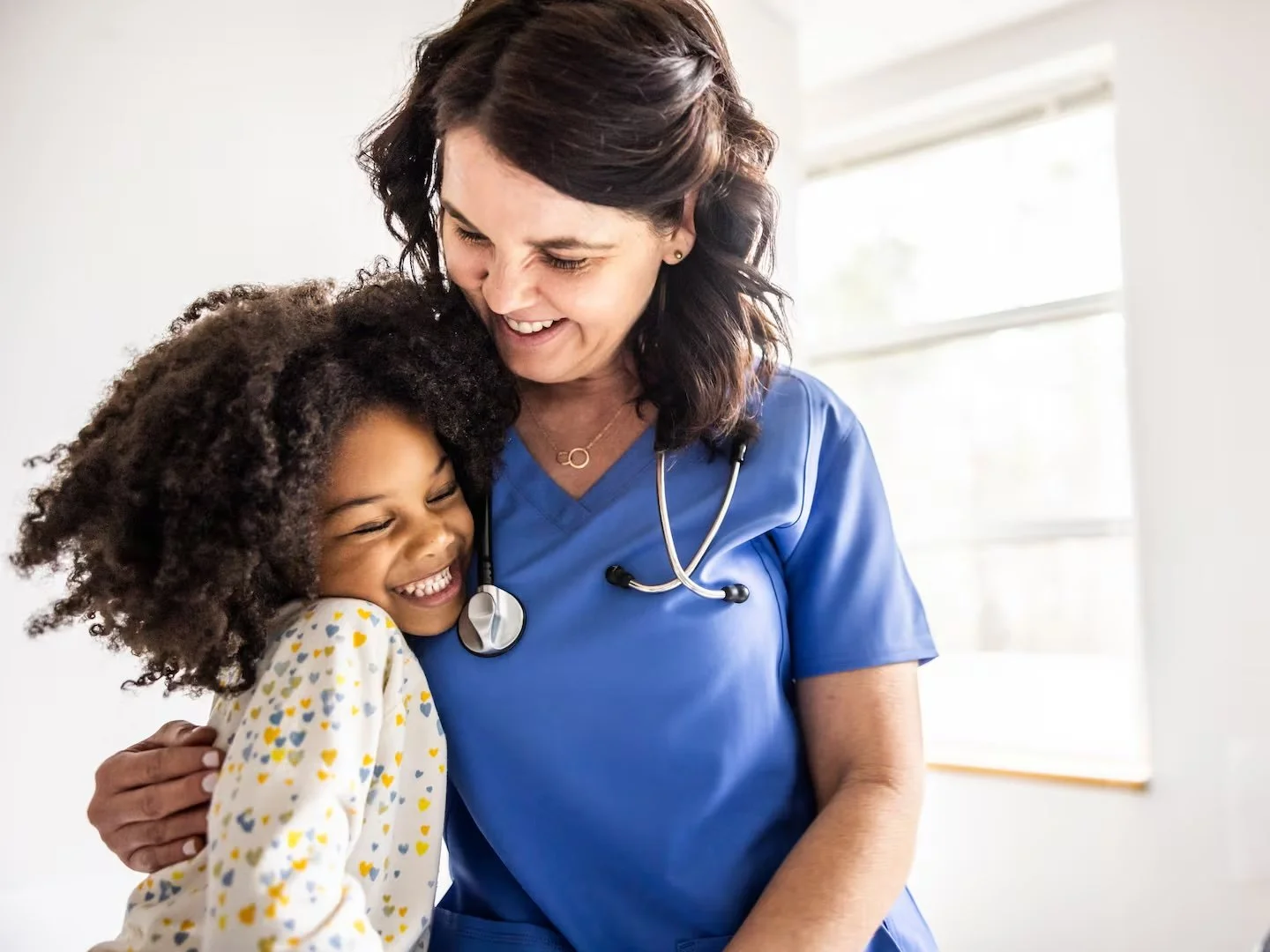
The second—and ultimately chosen—direction centered emotionally honest, impactful moments between nurses and patients, or between nurses themselves, cropped in close. The word “This” pulled viewers directly into the photograph, with “is the power of nursing” completing the thought below. It was a show-don’t-tell approach to demonstrating the power of nursing in practice.
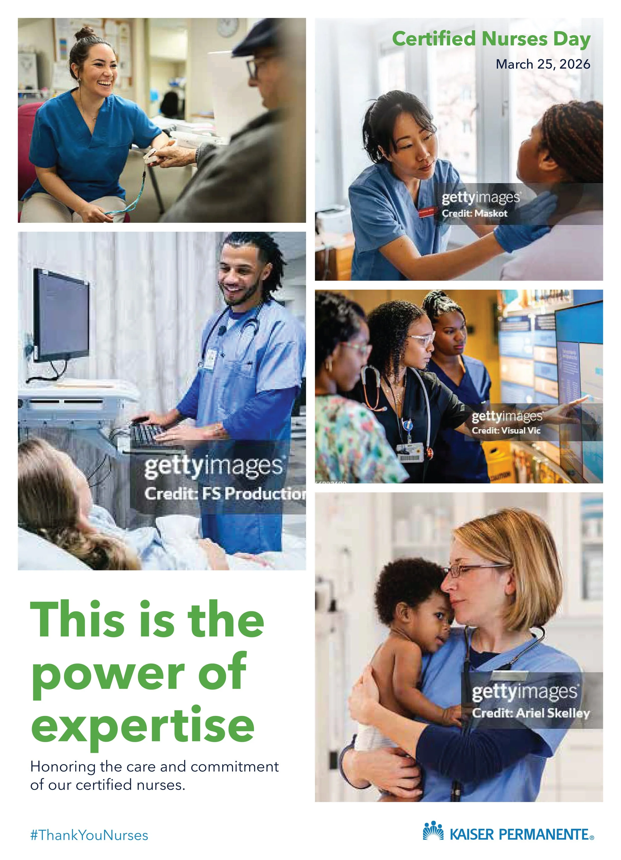
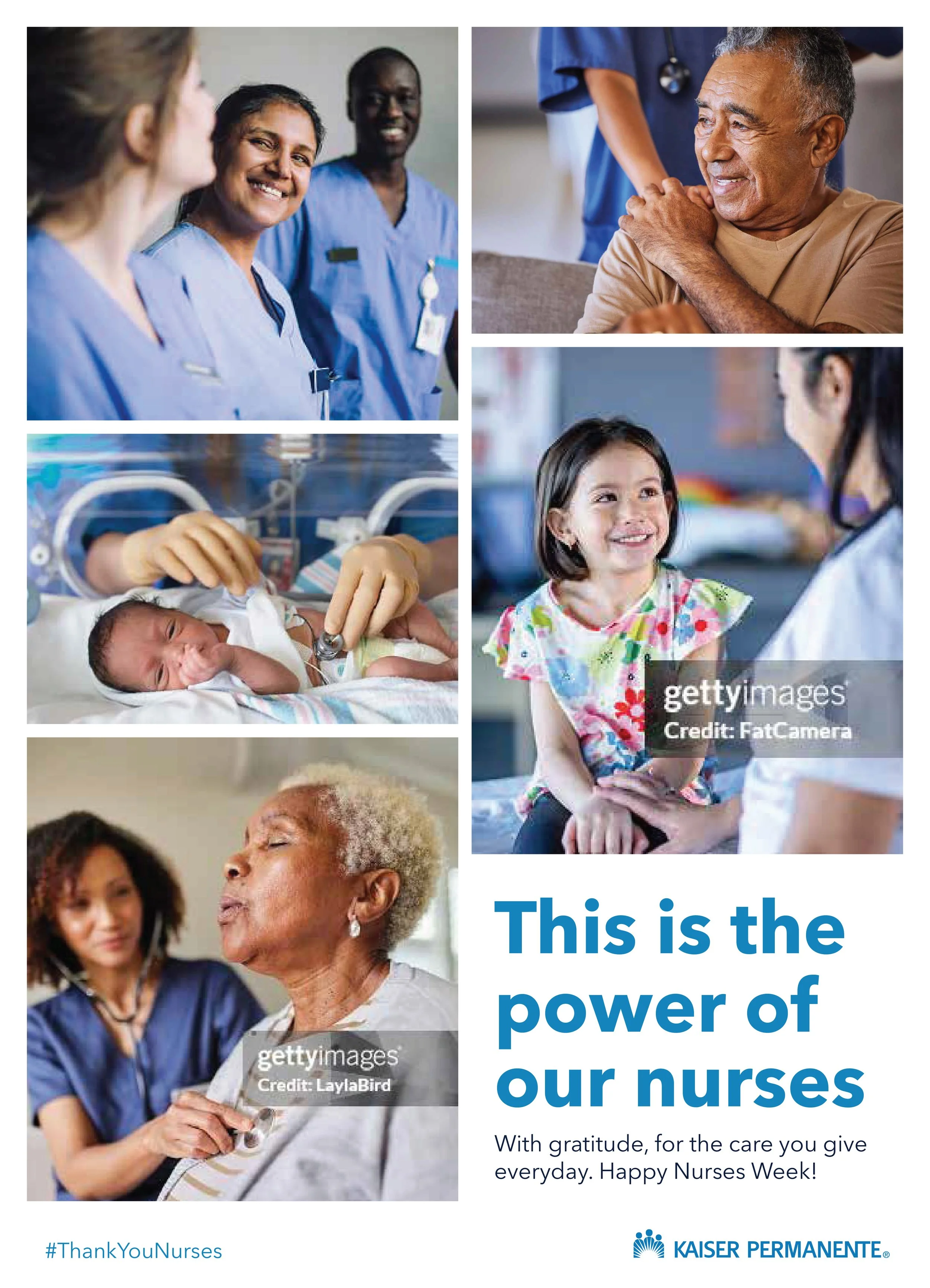
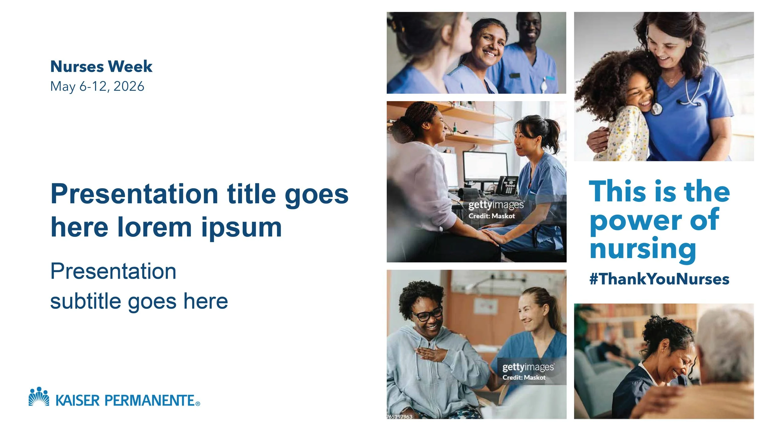
showcasing nurses in action
The third was a variation on the same idea: a brick-like grid of photographs that collectively carried the tagline and emphasized the diversity of nursing as a discipline.
