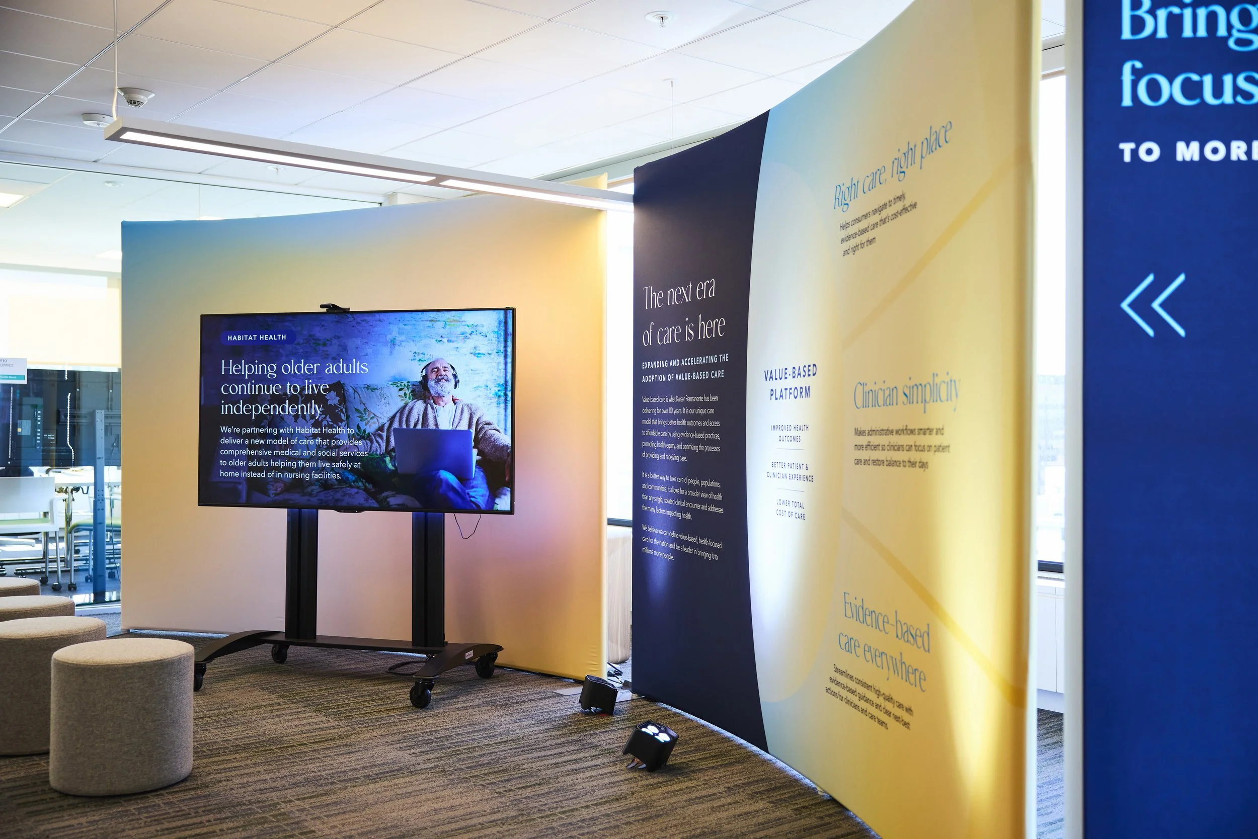
Exhibition setup with a large digital screen displaying an elderly man and text about helping older adults live independently. There are yellow and blue informational panels with text about value-based care, evidence-based treatment, and healthcare outcomes. The area has seating and is lit by ceiling lights.

Concept & Strategy – Kaiser Permanente

GARFIELD CENTER POP-UP EXPERIENCE

Kaiser Permanente's Garfield Innovation Center needed a way to bring the value-based care model to life for visitors — through a guided tour experience that felt immersive and intentional, built inside a working office space that couldn't be permanently altered.

ROLE

Concept & strategy, final production design

AUDIENCE

B2B customers and prospective community partners

DELIVERABLES

Content strategy, Visitor journey and floor plan, Environmental design
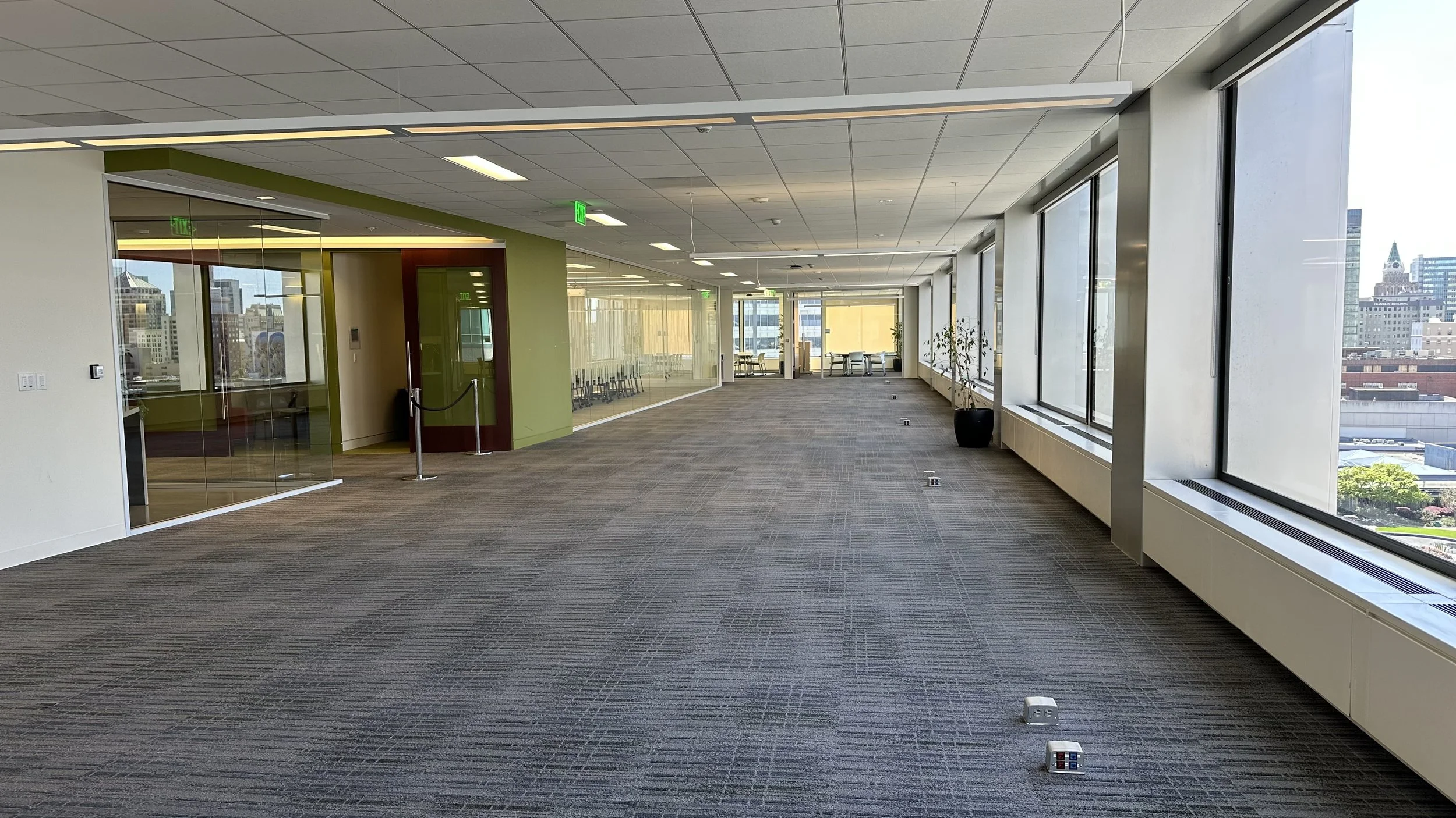
Empty office corridor with large windows, green and beige walls, glass-walled conference room, and cityscape view.

Finding the Story in the Space

The first question wasn't how the space would look, but what it needed to say. The temporary space needed to serve as a tool for sales and business development partners, helping them demonstrate Kaiser Permanente’s position as a healthcare innovation leader to prospective customers and partners. The story had to be compelling, credible, and tellable through whatever props and demos could actually be moved into the space.
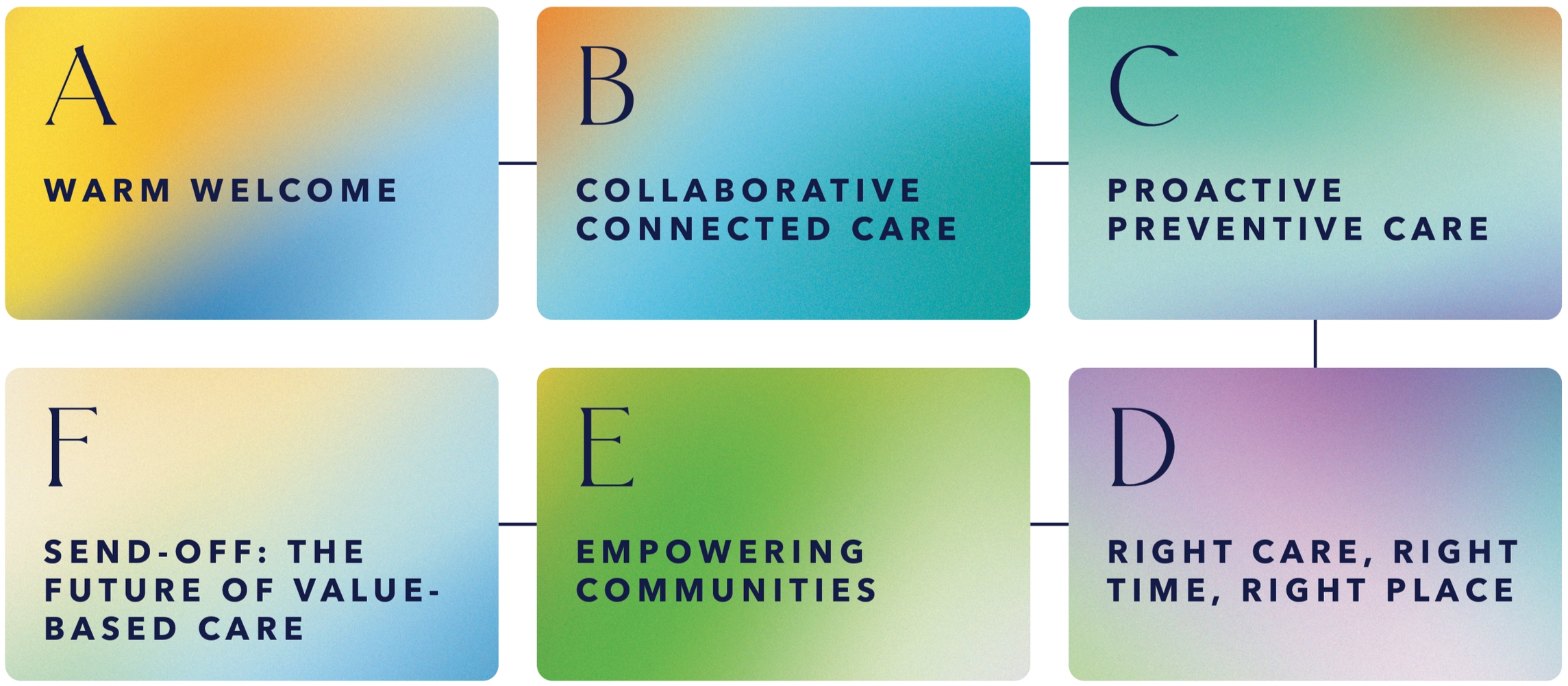


Working with the team, we developed a content strategy organized around distinct differentiators that each had a kernel of innovation. Through collaboration with the leadership team, we refined our focus to center on the organization's core innovation story: value-based care.
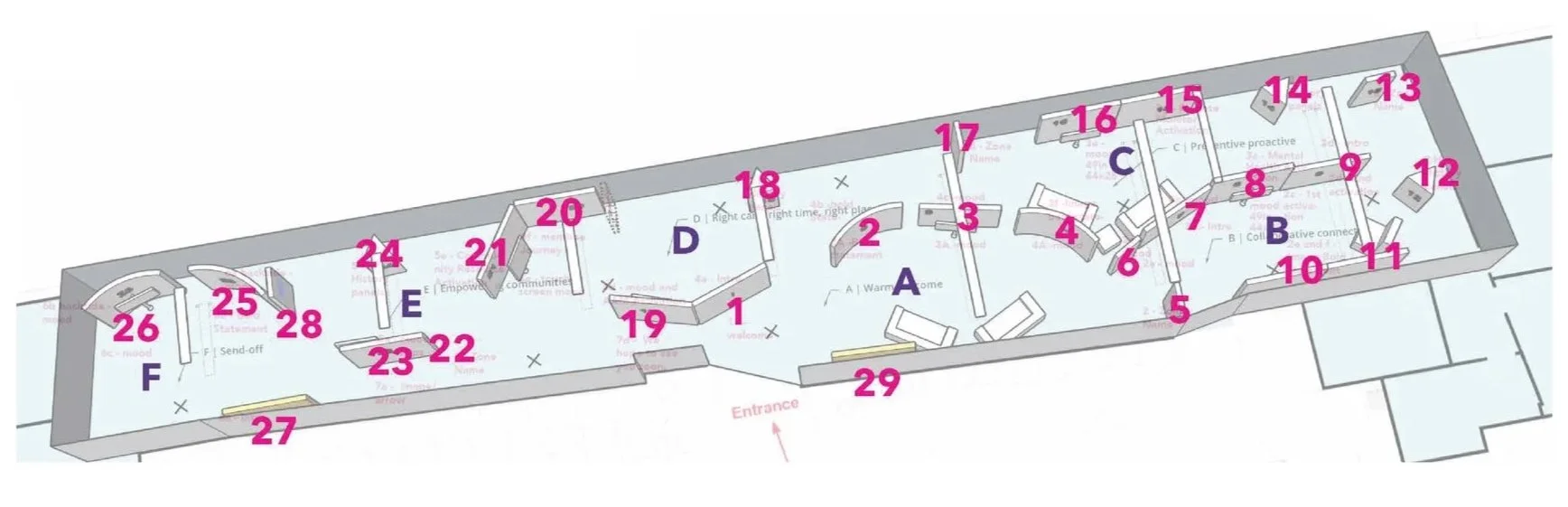
Floor plan of an emergency room or clinic with numbered stations and areas labeled with letters, including reception, waiting area, treatment rooms, and staff areas.

With the story established, the next question was how to move people through it. A long, open office environment isn't an obvious candidate for an immersive tour experience. I drafted the initial floor plan — a chance to dust off some old architecture school instincts — mapping a zone-by-zone journey from a “Warm Welcome” through the differentiator zones before arriving at a forward-looking send-off on the future of value-based care. The flow was refined through stakeholder feedback while moving into design.

Curved walls at the beginning and end helped guide visitors through the space and create a more natural sense of flow. Triangular kiosks were interspersed for historical touchpoints, weaving in the organization’s rich legacy of innovation.
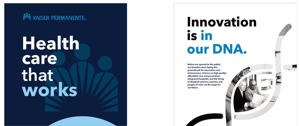

Two slides from a presentation. The first slide has a blue background with white and blue text reading 'Kaiser Permanente: Health care that works' and a silhouette of four figures with a fan-like design behind them. The second slide has a white background with black and blue text stating 'Innovation is in our DNA.' and includes a photo of people in a medical setting with a DNA strand graphic.
A presentation slide with a dark blue background, showing three sections. The first section has the text "Our integrated model connects the dots" with photos of diverse professionals. The middle section features a smiling woman at her laptop surrounded by a location marker with bullet points: proactive, accessible, evidence-based, empowering communities, and the phrase "The right care, where you are." The third section displays a upward trending bar graph with the text "Value you can measure" and a multiplication sign indicating cost savings times quality outcomes, illustrating increased value.

Initial visual direction

The initial visual direction began with Kaiser Permanente’s established brand expression, then pushed it toward something that felt more innovative, immersive, and future-facing.
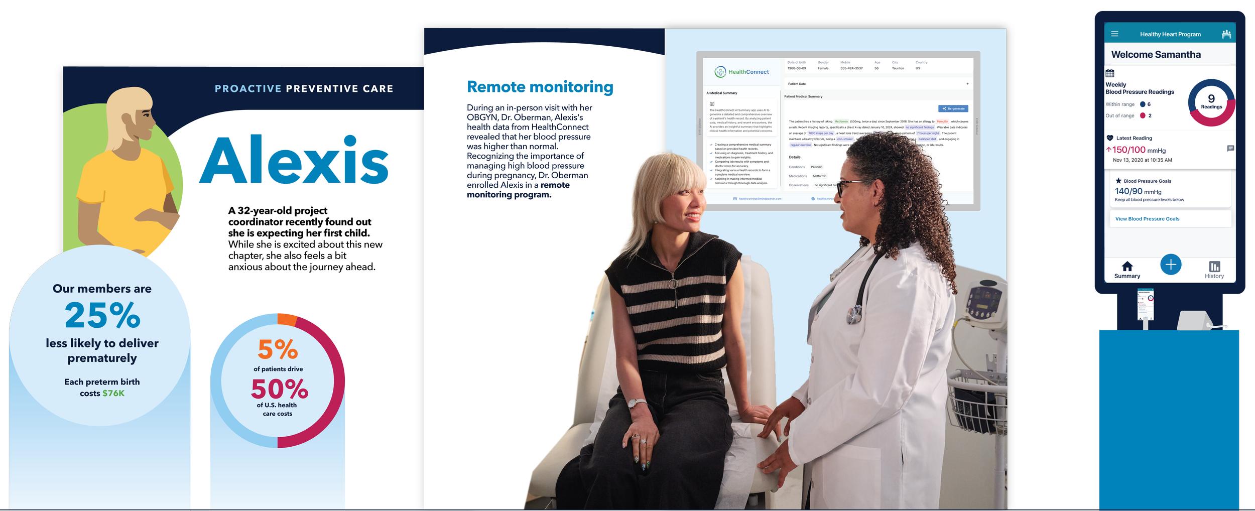
A medical consultation scene showing a female patient with blonde hair wearing a black and white striped top talking to a female doctor wearing glasses and a white coat in a clinical setting with digital health monitoring screens.
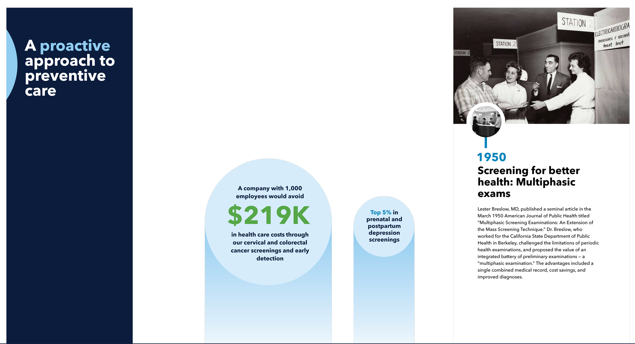
A black and white historical photo showing people at a health screening event, with signs labeled "Station 2" and "Station 3" and a caption about multihasic screening for better health from 1950.

Varying the height of the displays helped the environment feel more intentional, particularly in areas where low ceilings limited how tall the structures could be. Layering panels and visual elements added depth, preventing the experience from reading as a simple series of flat wall displays.


an evolving b2b brand

Midway through the project, Kaiser Permanente introduced an evolved visual identity for its business-to-business communications.

In addition to reskinning the design, we used the updated direction to give every zone its own visual atmosphere, making the progression of the story easier to follow while preserving a sense of continuity from beginning to end.
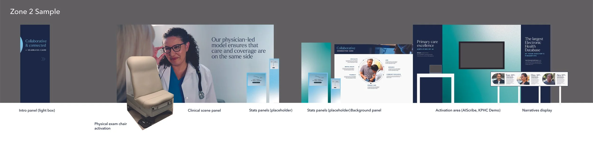
A presentation slide demonstrating a medical clinic or healthcare setting, including panels with images and text, a physical exam chair, and an activation area with a display screen and portraits of staff members.
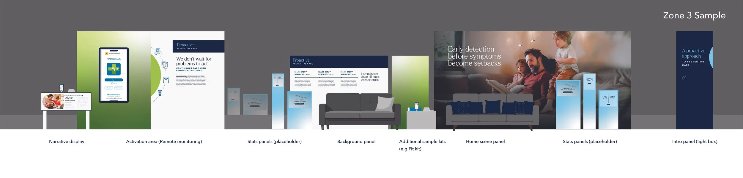
A detailed infographic showing the layout of a digital health care display zone, including sections such as a narrative display, remote monitoring activation area, stats panels, background panel, home scene panel, and an intro panel, with examples of content and graphics for preemptive health care.
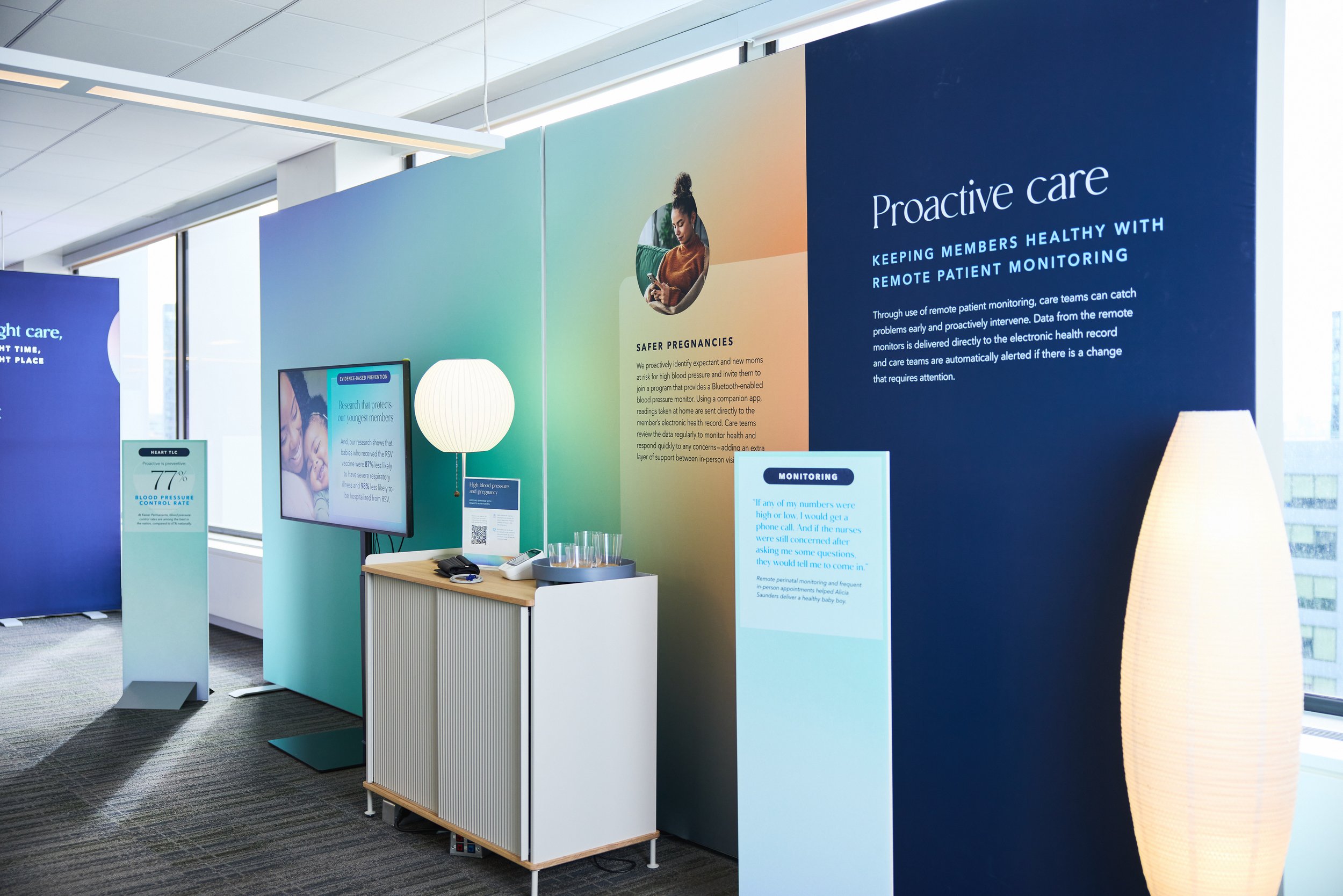
An exhibition booth displays information about proactive healthcare and remote patient monitoring, featuring a large blue and green wall with text, a monitor, a white curtain lamp, and a small table with phones and a remote control.

Bringing the experience to life

The final environment was built from curved fabric walls, illuminated graphics, digital displays, movable demonstrations, and freestanding furniture. Together, these elements transformed the office without permanently changing it.

I carried the work from content strategy and spatial concept through final production design and installation, collaborating with a small team of production designers whose involvement shifted over the course of the project. Together, we translated the narrative into a detailed system of panels, displays, and activation areas, including digital screensavers.

The result was a cohesive guided experience rather than a collection of disconnected exhibits — a physical expression of how Kaiser Permanente’s model connects care, evidence, technology, and community.
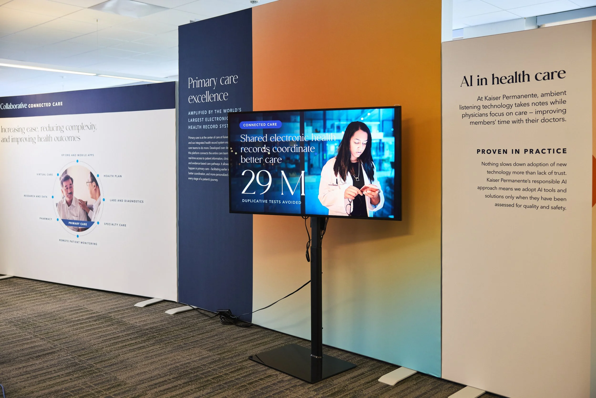
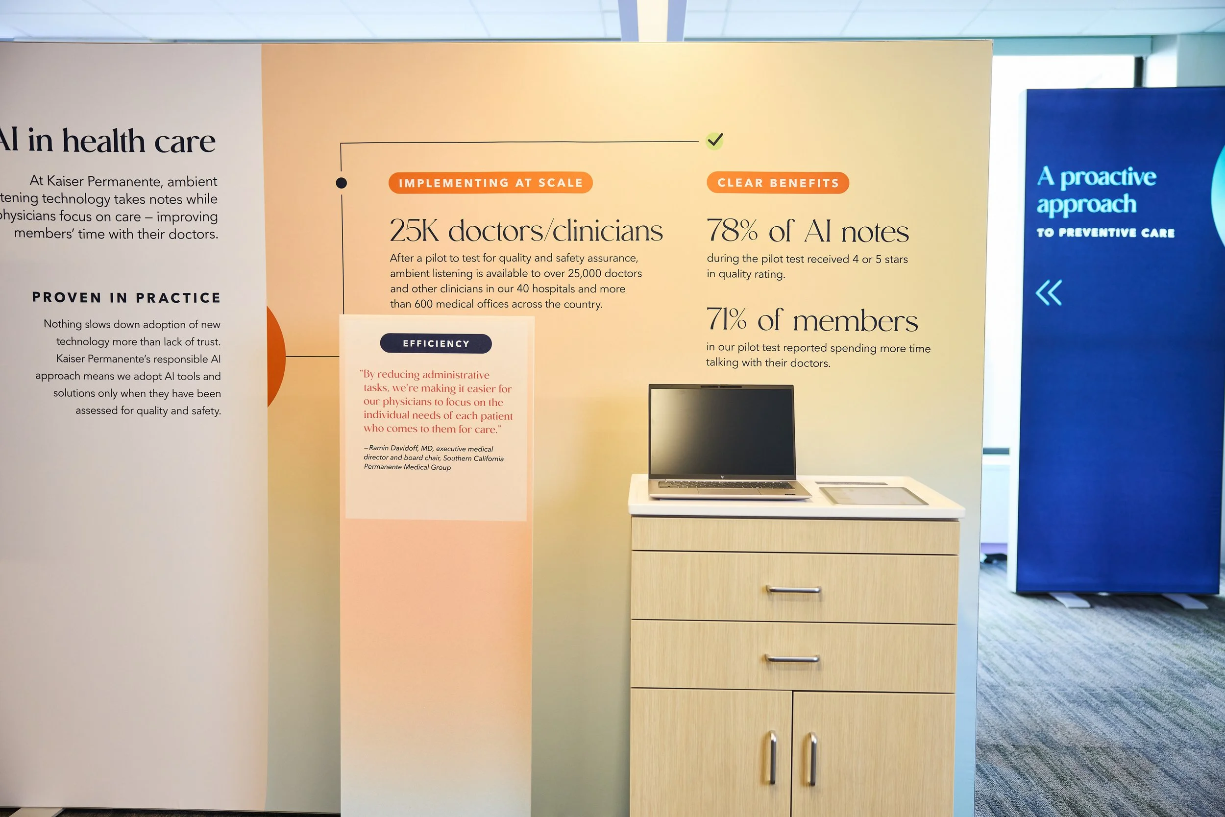
Exhibit booth with displays about healthcare technology at a conference, featuring a large screen showing statistics and text about electronic health records, AI in healthcare, and primary care excellence.
A health care informational display about AI implementation at Kaiser Permanente featuring statistics on doctor adoption and benefits, along with a laptop on a wooden cabinet.
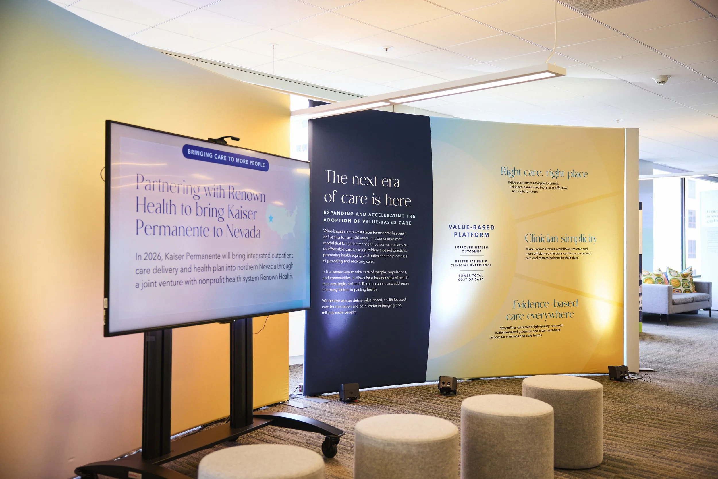
Indoor conference or seminar display with large navy and yellow informational panels and a digital screen, set in a room with carpeted floor and upholstered round stools.
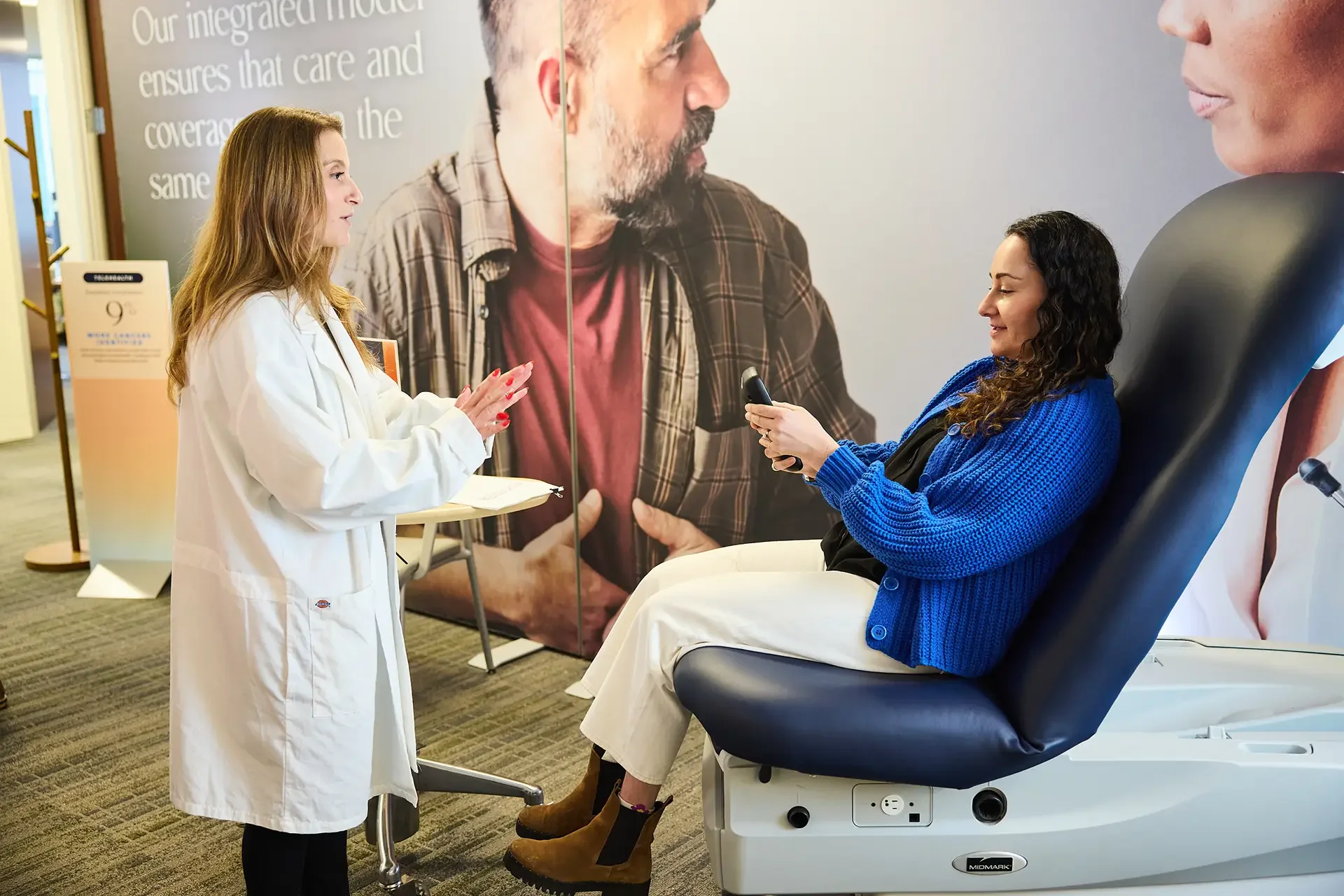
A healthcare professional, wearing a white coat, interviewing or consulting with a woman sitting on a medical examination chair in a medical facility or clinic. The woman is smiling and holding a phone in her hand. There is a large medical-themed poster or mural on the wall behind them.
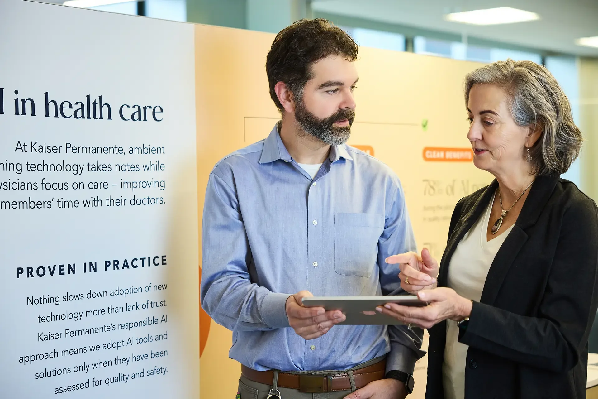
Two professionals, a man and a woman, engaged in a serious conversation at a health care conference. Behind them is a poster about health care technology at Kaiser Permanente.
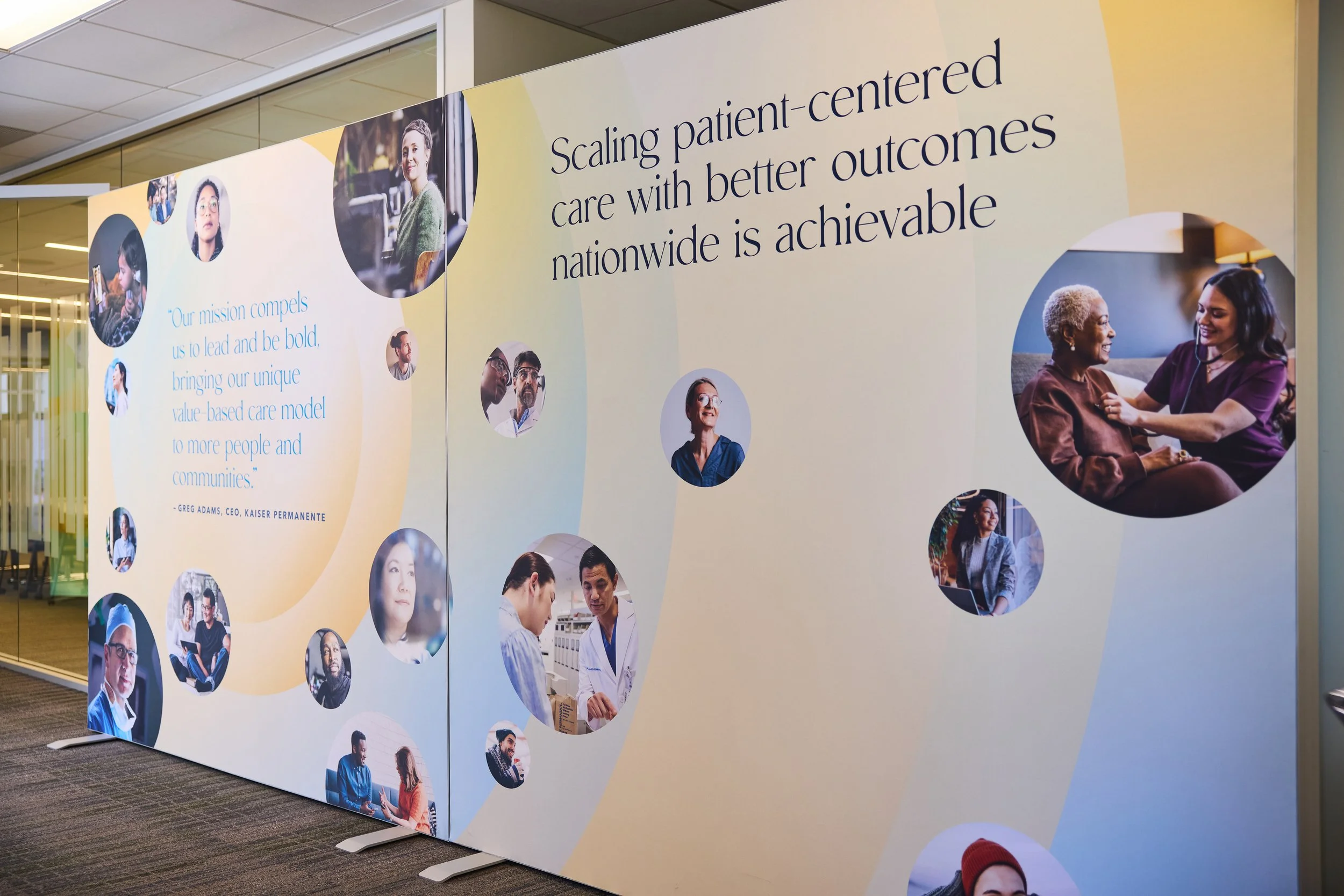
Large display wall with a healthcare or medical theme, featuring images of diverse healthcare professionals and patients, and text emphasizing patient-centered care and outreach.
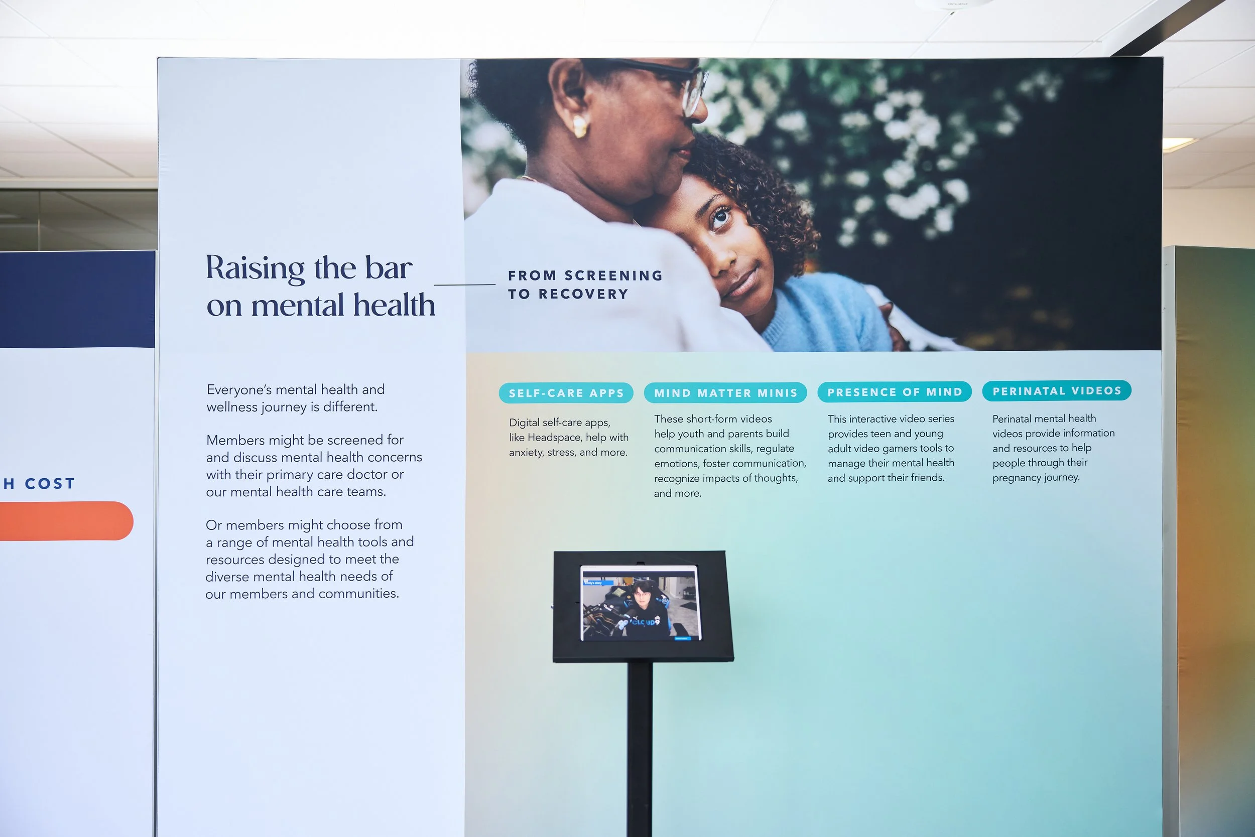
A large informational display board with a photo of a woman and a girl with curly hair, along with text about mental health resources and programs.
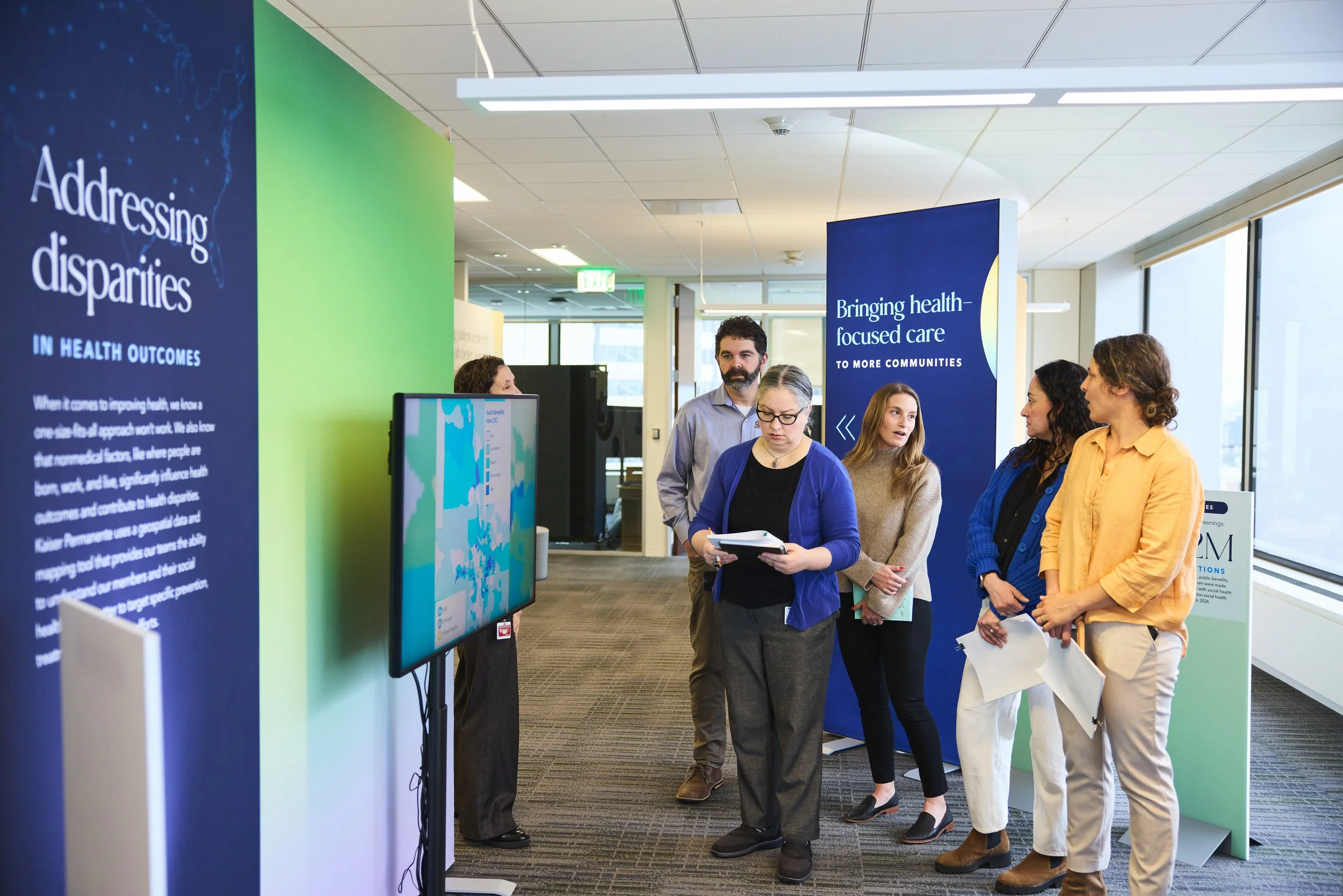
A group of five people standing in a hallway near exhibition stands with informational signs about health outcomes and communities. They are engaged and discussing, with some holding papers or notebooks.
A gray angle bracket